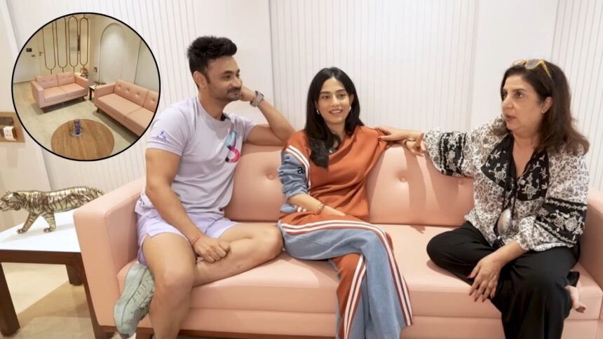
Actor Amrita Rao and radio host RJ Anmol recently opened the doors to their Mumbai home that feels warm, personal, and thoughtfully put together. Appearing on Farah Khan’s YouTube channel, their Mumbai apartment stood out for its soft, peachy-pink palette, , and a sense of lived-in comfort. The tone is set right at the entrance with a bold pink door, prompting Farah to remark, “Trust Amrita to have a pink door. She must have convinced Anmol, too.”
Inside, the design leans into warmth and familiarity rather than excess. A peach-toned sofa, neutral walls, mirror-panelled accents, and a relaxed balcony space create an inviting atmosphere. As Farah explored the living room, she pointed out, “This pink sofa. I love it,” while also appreciating the subtle colour coordination: “I like it. This peachy tone. This is the Pantone colour.” The home reflects a careful balance between personality and comfort, something that becomes even more apparent in the way objects and colours are layered together.
One of the most striking elements in the house is a piece of art that holds emotional as well as cultural value. Reacting to it, Farah exclaimed, “Oh my God. It’s a real Husain,” to which Amrita confirmed, “Yes.” The painting, inspired by her film Vivah, carries a story of admiration from the late artist, with Farah joking, “Husain sir pagal ho gaye the na Vivah dekh kar?” The home also features a large portrait inspired by Audrey Hepburn’s iconic look from Breakfast at Tiffany’s, blending global cinematic nostalgia with personal milestones.
Sonal Khangarot, licensed rehabilitation counsellor and psychotherapist, The Answer Room, tells indianexpress.com, “Warm tones like pink and peach can significantly influence how . As a psychologist, I often see how these colours evoke a sense of warmth, nurturance, and gentle containment—qualities that are essential for emotional regulation. Unlike more stimulating shades, soft pinks can reduce feelings of anger or agitation, while peach adds a subtle vibrancy without overwhelming the senses.”
These hues can be especially helpful in spaces meant for rest, connection, or healing, as they create an environment that feels inviting and reassuring. From a nervous system perspective, such tones can support a shift from a heightened, alert state to a more relaxed, grounded one. “However, it’s important that colour choices also align with personal associations and preferences, because emotional comfort is deeply subjective. The goal is to create a space that feels emotionally attuned to you,” notes Khangarot.
From a psychological perspective, Khangarot mentions that creating a home that is both aesthetically pleasing and emotionally comforting—especially in smaller urban spaces—requires intentional balance between function and feeling. “Clutter often increases cognitive load, so prioritising organisation and multi-functional furniture helps create a sense of control and calm.”
Equally important is personalisation. “Even in limited space, incorporating meaningful objects, soft textures, and calming colours can foster emotional safety and a sense of identity. Lighting also plays a crucial role; natural light enhances mood, while warm artificial lighting can ,” says the expert. Finally, Khangarot says that leaving some “breathing space” rather than over-designing every corner prevents overstimulation. A well-designed small home isn’t just efficient—it feels grounding, restorative, and reflective of the person living in it.